5 Luxurious Living Room Colour Combinations That Instantly Elevate a Space
- www.throwpillow.in
- Jan 28
- 5 min read

By Komal Tannan Nanda| Interior Design & Home Styling Expert| WWW.THROWPILLOW.IN

A luxurious living room is rarely about expensive furniture. It is about restraint, balance, and how colours interact with light, texture, and proportion. The most refined spaces use colour combinations that feel intentional—never loud, never accidental—and allow materials like wood, marble, fabric, and metal to quietly do the work.
Below are four timeless yet high-impact living room colour combinations that consistently create visual depth, emotional comfort, and long-term elegance, especially in modern Indian homes where light, climate, and space play a critical role.
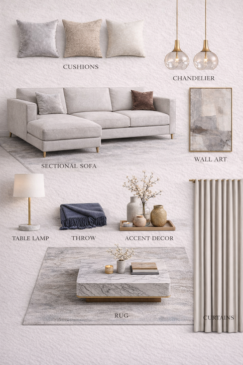
The five proven luxurious living room color combinations, explained through color palette, walls, curtains, sofa, cushions, rug, center table, lamps, chandeliers, and styling logic. Each section includes designer-level tips people usually overlook, written for practical Indian homes and modern apartments.
1. Midnight Blue, White & Natural Wood-– Modern Luxe Calm

Color Palette
Midnight blue, soft white, marble grey, light oak, brushed brass.
Midnight blue works best when it behaves like a background rather than a statement. In a living room, this colour anchors the space visually, allowing lighter elements to float forward.
When paired with soft white upholstery and warm wood tones, the result is grounded yet airy.
Why this combination works
Midnight blue absorbs excess visual noise, making the room feel composed
White upholstery reflects light, preventing the space from feeling heavy
Wood introduces warmth, breaking the coolness of blue

Design details that elevate the look
Textured navy walls instead of flat paint to add depth without pattern
Marble-topped coffee tables to introduce softness through veining
Blue looks richer under warm lighting, not cool white.
Brass should appear in minimum three places (lamp, table, frame).
Keep wood tones light to avoid heaviness.
Avoid glossy blue paint; matte or suede finish feels premium.
One oversized art piece works better than many small frames
Brass or brushed gold lighting for a subtle reflective layer


Sectional sofa, navy cushions, marble coffee table and brass pendant lights styled in a midnight blue living room
A designer insight
“Deep colours feel luxurious when they are allowed to sit quietly. Midnight blue works best when the furniture around it remains calm and tactile,” notes interior designer Ananya Mehra.
What most people overlook
Midnight blue needs breathing space. Keeping ceilings white and flooring warm-toned ensures the colour reads as elegant, not overpowering.
2. Blush Pink with Black, White & A Hint of Gold

Soft, modern, and quietly confident
Blush pink is often misunderstood as playful or temporary. In reality, when balanced with black, white, and restrained gold accents, it becomes surprisingly architectural.
This palette works especially well in apartments where natural light is diffused rather than harsh.
Why this combination works
Blush pink softens sharp lines and hard materials
Black and white add contrast and structure
Gold acts as a connector, not a highlight

Styling choices that matter
Upholstery in matte blush fabrics rather than glossy finishes
Black-and-white marble or patterned flooring to ground the palette
Gold kept to thin frames, lighting, or table bases only


A designer observation
“Soft colours gain authority when they are framed by contrast,” says interior stylist Rhea Kapoor.
“Blush becomes sophisticated when it leans neutral, not sweet.”
Common mistake to avoid
Using too many pink tones. One dominant blush shade is enough—layer the rest through texture, not colour.
3. Greys with Marble & Gold Accents

Modern luxury with long-term appeal
Grey is one of the most reliable colours for a luxurious living room because it adapts. It changes with light, season, and surrounding materials.
When layered with marble and gold, grey moves from minimal to indulgent without ever feeling decorative.
Why this combination works
Grey creates visual continuity across walls, furniture, and rugs
Marble introduces organic variation through veining
Gold adds warmth and reflection, preventing flatness

Key elements that define the space
Warm greige walls instead of cool cement grey
Marble used vertically (panels, artwork backdrops) for height
Gold finishes kept brushed or champagne-toned


A design principle worth noting
“Luxury often comes from repetition,” explains architect Sandeep Arora. “When grey appears in multiple textures—fabric, stone, paint—it feels intentional rather than neutral.”
Small change, big impact
Switching glossy marble to honed or matte marble instantly makes the room feel more refined and less showroom-like.
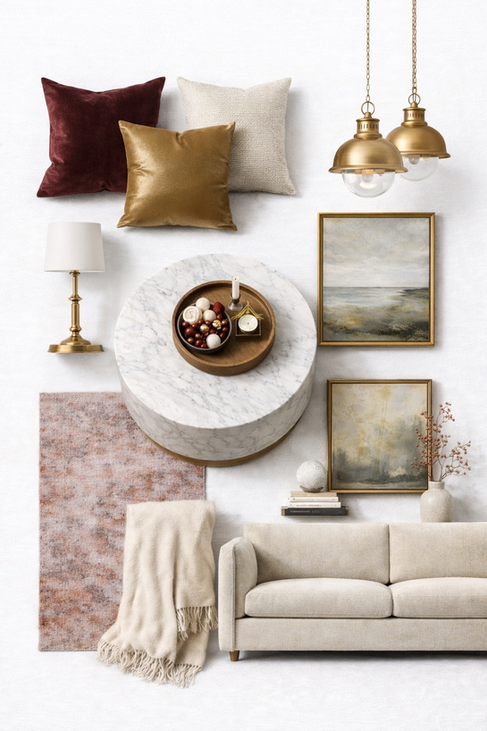
Plum Red with White & Gold Accents

Where warmth meets quiet luxury—deep wine walls, soft neutrals, marble textures, and brushed brass lighting come together to create a living room that feels intimate, elegant, and timeless. Dramatic, intimate, and deeply luxurious
Plum red is not for casual spaces—and that is exactly why it works so well in formal living rooms. This colour adds emotional depth, making the space feel intimate and layered.
Balanced with white and gold, it avoids heaviness and feels curated rather than dark.
Why this combination works
Plum red adds richness without the brightness of classic red
White balances visual weight and keeps the room open
Gold enhances warmth and highlights architectural details

A warm, layered living room mood board where muted burgundy, soft ivory, natural oak, blush stone, and brushed brass come together effortlessly. This palette balances richness with restraint—textured fabrics, marble surfaces, warm metals, and subtle artwork creating a space that feels quietly luxurious, timeless, and deeply inviting. Styling techniques that make it successful
Plum used on walls, not upholstery, for longevity
Neutral sofas to anchor the room visually
Gold lighting and accessories placed symmetrically
A quiet design insight
“Dark colours feel luxurious when paired with order,” notes interior designer Kavita Rao. “Symmetry and clean lines allow rich colours to breathe.”
What changes everything
Adding warm lighting. Plum walls under cool light feel flat, but under warm light they glow.
Soft Stone Neutrals with Marble & Brass
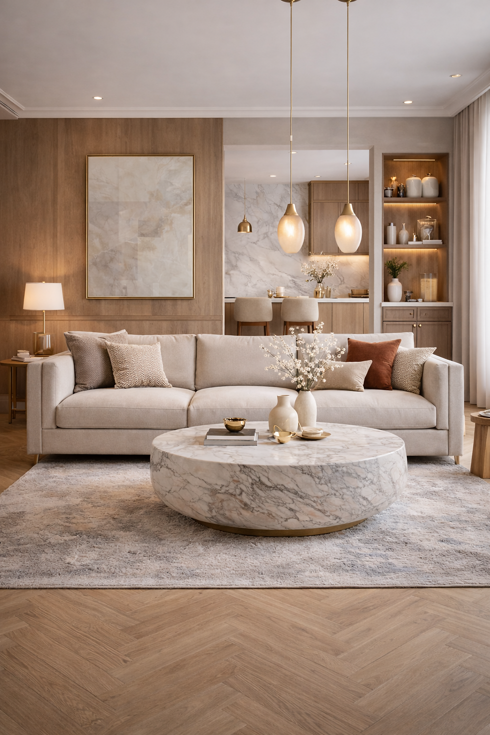
A soft stone neutral living room featuring plush upholstery, a sculptural marble coffee table, natural oak accents, and brass lighting. Colour palette & living room mood
This palette leans into warm greige, ivory, and taupe, layered with white marble and brushed brass. The living room feels serene, tactile, and deeply comforting—ideal for long hours of use.

Why this combination works
Stone neutrals reduce visual fatigue
Marble adds quiet luxury without pattern
Brass introduces warmth and reflection
Design details that elevate the look
Plush fabrics with visible weave
Sculptural coffee tables instead of angular forms
Brass kept matte and understated
A designer insight
“Luxury often comes from touch, not colour,” observes interior consultant Kavita Rao.
What most people overlook
Layering neutrals requires contrast in texture. Without it, the room can feel flat despite good colours.
How to Choose the Right Combination for Your Home
Before selecting a colour palette, consider:
Natural light direction and intensity
Room size and ceiling height
Existing flooring and permanent finishes
Luxury is not about following trends. It is about choosing a combination that continues to feel calm and intentional long after the first impression fades.
Save this for later
These palettes work because they are built on balance—between light and dark, soft and structured, quiet and expressive.
P.S. The most luxurious living rooms are not the ones that demand attention immediately, but the ones that feel better the longer you sit in them.


Comments